
Correlation heatmaps are widely used in omics, transcriptomics, proteomics, metabolomics, and many other data-rich fields. They turn dense correlation matrices into visual summaries that make structure easier to detect. Instead of scanning hundreds or thousands of pairwise coefficients, researchers can quickly see blocks, gradients, anti-correlated regions, and clusters of coordinated features. But a correlation heatmap is never just a picture of the data. What you see depends on how correlation is calculated, how the matrix is ordered, and how values are mapped to color. This guide explains how to build and interpret correlation heatmaps, with special attention to the practical differences between Pearson vs Spearman, the role of clustering, and the right way to read the final figure.
1. Why Correlation Heatmaps Matter in Omics Data Analysis?
Large-scale omics datasets contain rich correlation structure, but raw correlation matrices are hard to read. Once the number of variables grows, the matrix becomes statistically informative but visually inaccessible. Heatmaps solve this problem by converting the matrix into a spatial pattern that can be interpreted at a glance.
That is why heatmaps are so widely used in genomics and systems biology. Their value is not simply that they display correlation values, but that they make higher-order organization visible. A good heatmap helps the reader see whether the data contain modules, sample groupings, opposing trends, or little structure at all [1].
2. Pearson vs Spearman Correlation: Which One Changes the Heatmap?
The first major choice is the correlation metric. Pearson correlation measures linear association. It works best when the relationship between variables is approximately linear and the original scale of the data matters. Spearman correlation is rank-based and measures monotonic association. Because it relies on ranks rather than raw values, it is usually more robust to outliers and can capture consistent non-linear trends.
This choice matters because it can change the visible structure of the heatmap. Pearson may emphasize strong linear relationships, while Spearman may recover rank-preserving patterns that look weaker under Pearson. Comparative analyses show that the two methods may agree in well-behaved data but differ substantially in skewed, heavy-tailed, or noisy datasets [2].
In practice, the key point is simple: changing the correlation method can change the heatmap pattern. (Learn more at: Pearson vs Spearman Correlation)
| Feature | Pearson Correlation | Spearman Correlation |
|---|---|---|
| Measures | Linear association | Monotonic association |
| Input | Raw values | Ranks of values |
| Outlier sensitivity | High | Low (rank-based) |
| Non-linear trends | May miss them | Can capture rank-preserving patterns |
| Best suited for | Approximately linear relationships | Skewed or noisy datasets |
3. How to Build a Correlation Heatmap Correctly
3.1 Start with a Correlation Matrix
A correlation heatmap begins with a square matrix of pairwise correlation coefficients. The matrix is symmetric, because the correlation between variable A and variable B is the same as that between B and A. The diagonal consists of self-correlations, which are typically equal to 1. The heatmap is simply a visual encoding of this matrix, in which each cell—that is, each square in the heatmap—is assigned a color according to the sign and magnitude of the coefficient.
Although the transformation appears simple, its analytical value is substantial. The heatmap preserves the matrix while making its internal organization perceptible. Instead of inspecting values one by one, the viewer can immediately detect concentration, separation, contrast, and continuity [1].
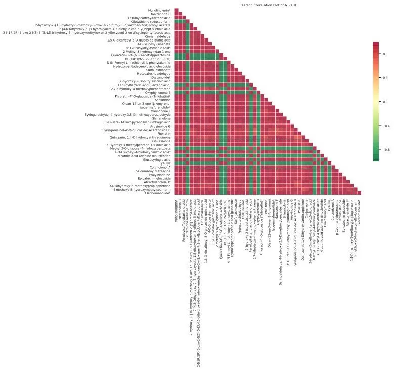
Figure 1. Heatmap of correlation of different metabolites.
3.2 Use Clustering to Reveal Structure
For most real-world datasets, the order of rows and columns determines whether the heatmap is informative. If variables are left in arbitrary order, meaningful structure may be present but visually fragmented. This is why clustering is so important.
Since early gene expression studies, clustered heatmaps have been used to reorder rows and columns according to similarity, so that similar variables are placed next to one another. This does not create new structure; rather, it makes existing structure legible. Once the matrix is reorganized, correlated features often appear as contiguous blocks near the diagonal, while negatively related groups may appear as contrasting regions [1].
This is the key value of clustering in correlation heatmaps: it converts a visually unordered matrix into an interpretable map of modules and boundaries. In omics analysis, this is often the point at which biological or technical organization first becomes apparent.
3.3 Choose a Diverging Color Scale
Because correlation values are centered around zero and extend in two directions—negative and positive—the most appropriate visual encoding is usually a diverging color scale. Diverging palettes are specifically designed for variables that have a meaningful midpoint and two opposite extremes.
For correlation heatmaps, zero should function as the visual center. Positive and negative correlations should occupy opposite sides of the palette, and near-zero values should appear visually neutral. This is not a stylistic detail; it is essential for preserving interpretability. A poorly chosen palette can blur directional contrast or exaggerate weak effects.
Scale consistency is equally important. When multiple heatmaps are compared, they should use the same value range and the same midpoint. Otherwise, identical colors may correspond to different correlation strengths across plots, making comparison unreliable.
4. Which Correlations Are Statistically Meaningful?
A heatmap cell shows the direction and magnitude of a correlation, but not whether the relationship is statistically reliable. That is why some heatmaps include p-values, asterisks, or other significance annotations. Still, significance should be interpreted carefully. A p-value is not an effect size. It tells you whether the data are compatible with a null hypothesis of no association, but not whether the correlation is large or biologically important [3]. In a heatmap, color reflects effect size; significance reflects statistical support.
Because large matrices involve many pairwise tests, multiple-testing correction is also important. The false discovery rate framework introduced by Benjamini and Hochberg remains one of the most widely used approaches in large-scale analyses.
A common mistake is to trust either color or significance alone. Strong-looking colors may reflect unstable estimates, while very small but statistically significant correlations may have limited biological value. Reliable interpretation requires both magnitude and inferential context.
5. How to Interpret a Correlation Heatmap Step-by-Step
The clearest way to explain heatmap interpretation is to walk through a real published example. A particularly useful case is the Figure from Lee et al. (2019), which presents two Pearson correlation heatmaps from a large metabolomics compendium: one across 448 metabolites and one across 627 samples, both ordered by unsupervised hierarchical clustering. Because the same figure includes both a molecule-level and a sample-level heatmap, it is ideal for showing how one visualization format can support two very different reading strategies [4].
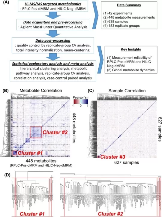
Figure 2. How to Read a Correlation Heatmap: A Real Example from Metabolomics Data.
Image reproduced from Lee, H. J., Kremer, D. M., Sajjakulnukit, P. et al., 2019, Metabolomics: Official Journal of the Metabolomic Society, licensed under the Creative Commons Attribution License (CC BY 4.0).
Step 1: Read the Overall Structure First
The first question should not be "Which square is the darkest?" It should be "What kind of structure does this matrix have?"
In Lee et al., the metabolite heatmap shows clear diagonal blocks, while the sample heatmap is much more diffuse overall. That contrast is already informative. It suggests that the dataset contains stronger organized structure at the metabolite level than at the sample level. This is why a correlation heatmap should be read as a map of structure rather than a collection of individual coefficients [4].
Step 2: Use Clustering to Identify Modules
Next, read the heatmap together with the dendrogram. In Figure B, hierarchical clustering groups correlated metabolites into contiguous diagonal regions. Lee et al. identify two prominent clusters. Cluster #1 contains 31 metabolites enriched in purine, pyrimidine, glycine/serine, and glutathione metabolism, while Cluster #2 contains 88 metabolites linked to the TCA cycle, glycolysis, pyruvate metabolism, and phenylalanine/tyrosine/tryptophan metabolism [4].
This is exactly what clustering is supposed to do. It turns a dense matrix into visible modules, allowing the reader to move from pairwise correlation to pathway-level coordination.
Step 3: Read Color as a Pattern, Not as a Single Signal
In this figure, color represents Pearson correlation coefficients, so it encodes both strength and direction. But the real point is not that one cell is dark. The meaningful observation is that many neighboring cells share similar colors and form stable regions across the matrix [4].
That is why the most informative unit in a correlation heatmap is usually not the individual square, but the repeated spatial pattern. A single strong pair may be interesting, but a coherent block is usually far more biologically meaningful.
Step 4: Ask What Kind of Objects Are Being Correlated
This is where the figure becomes especially useful. In Figure B, the objects are metabolites. The heatmap is therefore interpreted biologically: the main question is whether correlated blocks correspond to biochemical modules or metabolic pathways [4]. In Figure C, the objects are samples. Here the interpretation changes completely. Lee et al. note that the overall lack of strong clustering among samples reflects dataset heterogeneity and suggests that experimental bias is not driving the global structure. They also observe that the most correlated 25-sample cluster includes several different biological contexts rather than one obvious phenotype, implying that similar metabolic states can emerge across distinct perturbations [4].
This is a crucial lesson: the same heatmap format does not always answer the same question. A sample correlation heatmap is often about QC, heterogeneity, reproducibility, or batch structure. A molecular correlation heatmap is often about modules, co-regulation, and pathway organization.
Step 5: Move from Pattern to Explanation
A good heatmap interpretation does not stop at visual description. It asks what the visible structure means. Lee et al. do exactly that. In the metabolite heatmap, they link clustered regions to known metabolic pathways. In the sample heatmap, they interpret weak global clustering as a meaningful feature of a heterogeneous dataset rather than as a technical failure [4]. That is the right endpoint of heatmap reading: move from visual pattern to biological or technical explanation.
A practical rule is to read a correlation heatmap in the following order: overall structure first, clustering second, color pattern third, and interpretation last. In other words, do not begin with a single square when the figure is revealing modules.
6. Sample Correlation Heatmaps vs Molecular Correlation Heatmaps
Although the visualization format is the same, sample-level and molecule-level heatmaps serve different purposes. A sample correlation heatmap is usually diagnostic. It helps assess reproducibility, identify outliers, detect batch effects, and evaluate whether samples cluster as expected. A molecular correlation heatmap is usually biological. It is used to identify modules of co-varying genes, proteins, or metabolites that may reflect pathway activity, shared regulation, or systems-level organization. The figure may look similar, but the logic of interpretation is not.
| Feature | Sample Correlation Heatmap | Molecular Correlation Heatmap |
|---|---|---|
| Purpose | Diagnostic (QC, reproducibility) | Biological (modules, pathways) |
| Objects correlated | Samples | Genes, proteins, metabolites |
| Key questions | Outliers, batch effects, sample grouping | Co-regulation, pathway activity, modules |
| Interpretation logic | Technical and experimental | Biological and systems-level |
7. Correlation Heatmap vs Correlation Network
Heatmaps and networks are often built from the same correlation matrix, but they emphasize different aspects of structure. A heatmap preserves the full matrix and is best for seeing global organization: blocks, gradients, modules, and opposing regions [1]. A network converts correlations into edges between nodes, often after applying thresholds or weighting schemes. Once that happens, the focus shifts from matrix structure to graph structure, including hubs, communities, and connectivity [5]. In short, heatmaps are best for seeing overall structure, while networks are best for seeing selected connections.
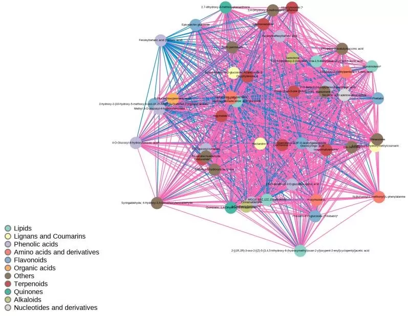
Figure 3. Correlation network diagram of differential metabolites.
8. Final Thoughts on Correlation Heatmaps
Correlation heatmaps help researchers move from individual coefficients to broader patterns in omics data, including modules, gradients, and sample-level structure. Because their interpretation depends on choices such as Pearson vs Spearman correlation, clustering, and color scaling, they should always be read with both analytical context and biological meaning in mind. For users who want a simpler workflow, cloud-based tools such as the Metware Cloud Platform can make correlation heatmap analysis more accessible.

Figure 4. Metware Cloud Platform — Correlation Heatmap Analysis Panel for one-click omics data visualization.
MetwareBio: Your Trusted Partner for Multi-Omics Data Analysis
MetwareBio provides comprehensive omics data analysis solutions, from metabolomics services and proteomics services to integrated multi-omics analysis, supported by an experienced bioinformatics team and advanced cloud-based tools. The Metware Cloud Platform offers 50+ free online analysis tools, including correlation heatmap analysis, with intuitive interfaces and detailed tutorials — no programming required.
If you are interested in correlation heatmap analysis or other omics data visualization, please do not hesitate to contact us.
Contact UsReferences
- Gu, Z., Eils, R., & Schlesner, M. (2016). Complex heatmaps reveal patterns and correlations in multidimensional genomic data. Bioinformatics (Oxford, England), 32(18), 2847–2849. https://doi.org/10.1093/bioinformatics/btw313
- de Winter, J. C., Gosling, S. D., & Potter, J. (2016). Comparing the Pearson and Spearman correlation coefficients across distributions and sample sizes: A tutorial using simulations and empirical data. Psychological methods, 21(3), 273–290. https://doi.org/10.1037/met0000079
- Sullivan, G. M., & Feinn, R. (2012). Using Effect Size-or Why the P Value Is Not Enough. Journal of graduate medical education, 4(3), 279–282. https://doi.org/10.4300/JGME-D-12-00156.1
- Lee, H. J., Kremer, D. M., Sajjakulnukit, P., Zhang, L., & Lyssiotis, C. A. (2019). A large-scale analysis of targeted metabolomics data from heterogeneous biological samples provides insights into metabolite dynamics. Metabolomics: Official journal of the Metabolomic Society, 15(7), 103. https://doi.org/10.1007/s11306-019-1564-8
- Zhang, B., & Horvath, S. (2005). A general framework for weighted gene co-expression network analysis. Statistical applications in genetics and molecular biology, 4, Article17. https://doi.org/10.2202/1544-6115.1128
