Comparative Analysis of Venn Diagrams and UpSetR in Omics Data Visualization
1. Introduction to Omics Data Visualization
When conducting omics data analysis, such as in transcriptomics, metabolomics, proteomics, etc., it is often necessary to identify shared or unique information across different comparative groups. This information can be instrumental in elucidating biological processes. Today, we will provide an in-depth look at two analytical tools that serve this purpose: Venn diagrams and UpSetR.
2. Venn Diagrams
2.1 What Are Venn Diagrams?
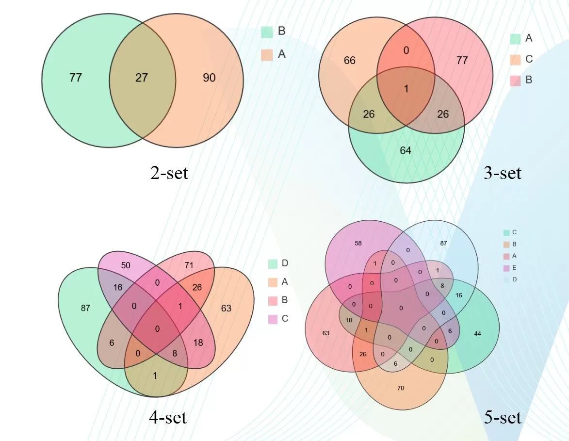
Venn diagrams are logical tools that represent the relationships among multiple sets, showcasing the quantity of shared or unique elements within various samples or groups. Venn diagrams typically come in 2-set, 3-set, 4-set, and 5-set configurations.

2.2 Interpreting Venn Diagrams
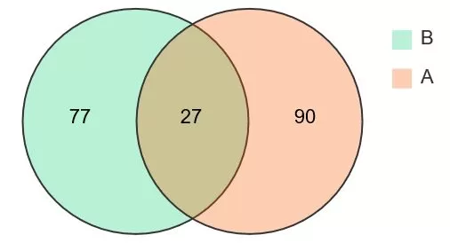
 Taking a 2-set Venn diagram as an example, let's consider two samples, A and B, represented by orange and green circles, respectively. The intersection of these circles, where the colors overlap, represents shared elements between the samples. For instance, if the values within the circles represent the unique metabolites in samples A and B, which are 90 and 77, respectively, the value in the overlapping section represents the shared metabolites, which is 27 in this case. This clarifies the logical relationship between the two samples. To further analyze the shared or unique metabolites between samples, one can download the Venn diagram analysis results for quick access to the data.
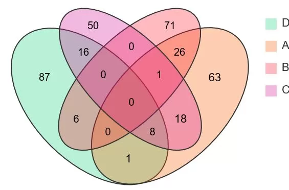
 Similarly, a 4-set Venn diagram uses four distinct colors to represent four samples. The central overlap indicates the shared metabolites among all four samples. From this diagram, one can discern the unique metabolite counts for each sample, as well as the shared metabolites between any two or three samples, by examining the respective overlapping areas.
3. UpSetR
3.1 Introducing UpSetR
To understand UpSetR, it's essential to first grasp the concept of Venn diagrams. As previously discussed, Venn diagrams are a solution for the quantitative visualization of set intersections but are limited by the number of groups they can represent. Thus, there is a need for a scalable alternative to Venn diagrams for visualizing intersections and their attributes, which is where UpSetR comes into play. UpSetR offers an expandable, matrix-based visualization that displays the intersections of sets, their sizes, and other attributes.
3.2 When to Use UpSetR
Generally, UpSetR is used for intuitively displaying the shared and unique information among more than five samples. Venn diagrams are limited to representing intersections among five or fewer samples. When dealing with complex intersections in a dataset of five or more samples, Venn diagrams may not efficiently assist researchers in extracting information. For example, while aesthetically pleasing, identifying the number of shared elements between Group A and Group B in a Venn diagram requires adding numerous parts, which is prone to error.
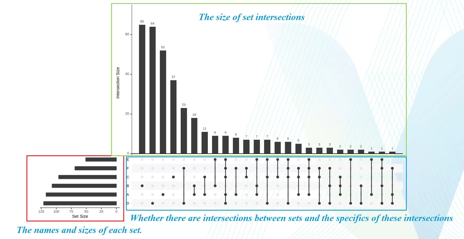
In contrast, UpSetR can be highly effective in such scenarios. By locating the black dots and lines corresponding to Groups A and B in an UpSetR plot, one can determine the number of shared elements between these two groups. For instance, in the analysis below, it is evident that Groups A and B share 18 common elements.

3.3 Reading UpSetR Plots
 An UpSetR plot typically consists of three main components: the red area represents the names and sizes of each set; the green area indicates the size of set intersections, corresponding to the blue area below; the blue area signifies whether there are intersections between sets and the specifics of these intersections, with black dots representing the presence in a set, black dots with connecting lines indicating intersections, and gray dots representing the absence from the intersection.
4. Comparing Venn Diagrams and UpSetR
Upon closer examination, it becomes evident that Venn diagrams and UpSetR serve different analytical purposes. Typically, when our objective is to visualize shared or unique information among five or fewer groups, Venn diagrams are the tool of choice. They provide a clear representation of the intersections and unique elements within this range of group comparisons.
However, when the number of groups or comparative sets extends to six or more, Venn diagrams reach their limitations. While they can still depict the commonalities across all six or more groups and the unique elements within each group, they fall short in illustrating the specific intersections between any two or three groups, for example. This is where UpSetR significantly outperforms traditional Venn diagrams by offering a comprehensive view of all possible intersections, regardless of the number of groups involved.
5. Choosing the Right Tool for Omics Data Analysis
Given this perspective, researchers can make an informed decision on which analytical approach to employ based on the specific characteristics of their experimental data. Whether it's the straightforward visualization of a Venn diagram for a smaller group comparison or the robust, scalable representation of UpSetR for more complex, multi-group analyses, the choice becomes a strategic aspect of the data exploration process.
Read More:
- How to understand the WGCNA analysis in publications? (1/2)
- Understanding WGCNA Analysis in Publications
- Harnessing the Power of WGCNA Analysis in Multi-Omics Data
- WGCNA Explained: Everything You Need to Know
- Metabolomic Analyses: Comparison of PCA, PLS-DA and OPLS-DA
- A Comprehensive Guide to Correlation Network Graphs
Next-Generation Omics Solutions:
Proteomics & Metabolomics
Ready to get started? Submit your inquiry or contact us at support-global@metwarebio.com.


