
Understanding K-means Clustering: A Comprehensive Guide
What is K-means Clustering?
K-means, proposed by Stuart Lloyd in 1957, is one of the most widely used unsupervised learning algorithms. It iteratively partitions data into ‘K’ non-overlapping clusters, maximizing intra-cluster similarity and inter-cluster differences. Here, ‘K’ denotes the predefined number of clusters, and "means" refers to the centroid (mean) of data points within each cluster.
The phrase "birds of a feather flock together" aptly describes clustering. However, it is crucial to distinguish clustering from classification:
- Classification involves predefined labels (supervised learning), where data is assigned to known categories.
- Clustering identifies hidden patterns in unlabeled data (unsupervised learning), grouping similar data points without prior knowledge of categories.
Applications of K-means Clustering
K-means is versatile across various domains:
Gene Expression Analysis: Clustering co-expressed genes to identify functional modules (e.g., cancer-related gene clusters). For example, RNA-seq data can group genes with similar expression patterns for GO/KEGG enrichment analysis.
Single-Cell Sequencing: Classifying cell subtypes (e.g., T cells, B cells) and annotating them. Tools like t-SNE or UMAP are often integrated for dimensionality reduction and visualizing cellular heterogeneity.
Proteomics: Clustering protein sequences or structures to predict conserved functional regions. Case studies include classifying proteins based on physicochemical properties (hydrophobicity, charge) to aid functional annotation.
Disease Subtyping: Stratifying patients into subtypes using multi-omics data (genomics, transcriptomics) to guide personalized therapies.
The K-means Algorithm: Step-by-Step
The algorithm consists of two core steps: Assignment and Update.
1. Initialize Centroids: Randomly select ‘K’ data points as initial centroids.
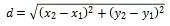
2. Assignment Step: Assign each data point to the nearest centroid using Euclidean distance.
3. Update Step: Recalculate centroids as the mean of all points in each cluster.
4. Iterate: Repeat assignment and update until centroids stabilize (convergence) or a maximum iteration threshold is reached.
Visualizing Iterations: Initially, centroids (black dots) are randomly placed. As iterations proceed, centroids shift, and cluster assignments (color-coded) adjust until convergence.

Iterative process for K-means analysis
Example: Clustering Data
Consider 2D data points representing customer "spending" and "visit frequency." We aim to cluster them into *K=2* groups.
|
Data Point |
Spending (x) |
Visits (y) |
|
Point 1 |
1 |
2 |
|
Point 2 |
2 |
1 |
|
Point 3 |
4 |
5 |
|
Point 4 |
5 |
4 |
|
Point 5 |
8 |
8 |
Step 1: Initialize Centroids
Randomly select Point 1 (1,2) and Point 5 (8,8) as initial centroids:
- C₁: (1, 2)
- C₂: (8, 8)
Step 2: Assign Clusters
Calculate Euclidean distances and assign points to the nearest centroid:
|
Point |
Distance to C1 |
Distance to C2 |
Centroids |
Cluster |
|
1 |
0 |
8.49 |
C1 |
C1 |
|
2 |
1.41 |
8.06 |
C1 |
C1 |
|
3 |
4.24 |
5 |
C1 |
C1 |
|
4 |
5 |
4.24 |
C2 |
C2 |
|
5 |
8.49 |
0 |
C2 |
C2 |
Result:
- Cluster 1: Points 1, 2, 3
- Cluster 2: Points 4, 5
Step 3: Recalculate Centroids
- New C1: ( (1+2+4)/3, (2+1+5)/3 ) = (2.33, 2.67)
- New C2: ( (5+8)/2, (4+8)/2 ) = (6.5, 6.0)
Step 4: Iterate Until Convergence
Repeat assignment and centroid updates until no further changes occur. Final clusters remain unchanged, with stable centroids at (2.33, 2.67) and (6.5, 6.0).
Choosing the Optimal K Value
Selecting K is critical but non-trivial. Common methods include:
1. Elbow Method: Plot the sum of squared errors (SSE) against ‘K’. The "elbow" (sharp decline in SSE slope) indicates the optimal ‘K’.
2. Silhouette Coefficient: Measures cluster compactness and separation. Higher values denote better clustering.
3. Calinski-Harabasz Index: Ratio of between-cluster to within-cluster variance. Maximize this value.
K-means Analysis & Visualization
1. Environment Setup
#Install required R packages:
if (!requireNamespace("factoextra", quietly = TRUE)) {
install.packages("factoextra")
}
if (!requireNamespace("cluster", quietly = TRUE)) {
install.packages("cluster")
2. Data Preparation
Use the `USArrests` dataset (crime statistics by U.S. state):
library(factoextra)
library(cluster)
data <- scale(USArrests)
data <- na.omit(data)
data <- scale(data)
head(data)
Murder Assault UrbanPop Rape
Alabama1.24256408 0.7828393 -0.5209066 -0.003416473
Alaska 0.50786248 1.1068225 -1.21176422.484202941
Arizona0.07163341 1.47880320.99898011.042878388
Arkansas 0.23234938 0.2308680 -1.0735927 -0.184916602
California 0.27826823 1.26281441.75892342.067820292
Colorado 0.02571456 0.39885930.86080851.864967207
3. Determine Optimal ‘K’
Visualize SSE using the Elbow Method:
fviz_nbclust(scale(data), kmeans, method = "wss") + geom_vline(xintercept = 4, linetype = 2) + labs(x="K", y="SSE")
The elbow at K=4 suggests optimal clustering.

Optimal number of clusters
4. Perform K-means Clustering
Finally, we perform the kmeans function, using k = 4 as the optimal value:
set.seed(1)
km <- kmeans(df, centers = 4, nstart = 25)
print(km)
K-means clustering with 4 clusters of sizes 13, 16, 13, 8
Cluster means:
MurderAssault UrbanPopRape
10.69507011.03944140.72263701.27693964
2 -0.4894375 -0.38260010.5758298 -0.26165379
3 -0.9615407 -1.1066010 -0.9301069 -0.96676331
41.41188980.8743346 -0.81452110.01927104
Clustering vector:
Alabama AlaskaArizona Arkansas California
41141
Colorado ConnecticutDelaware Florida Georgia
1 2 2 1 4
HawaiiIdaho IllinoisIndiana Iowa
23123
......
......
Within cluster sum of squares by cluster:
[1] 19.922437 16.212213 11.9524638.316061
(between_SS / total_SS =71.2 %)
Key Outputs:
- Cluster sizes: 13, 16, 13, 8
- Cluster means (centroids) for Murder, Assault, UrbanPop, and Rape.
5. Merging of Classification Results
After general K-means analysis, you can merge the clustering results with the original data to see the trend of the data.
# result <- cbind(Cluster = km$cluster, data)
head(result, 10L)
Cluster Murder Assault UrbanPop Rape
Alabama4 13.2 236 58 21.2
Alaska 1 10.0 263 48 44.5
Arizona18.1 294 80 31.0
Arkansas 48.8 190 50 19.5
California 19.0 276 91 40.6
Colorado 17.9 204 78 38.7
Connecticut33.3 110 77 11.1
Delaware 35.9 238 72 15.8
Florida1 15.4 335 80 31.9
Georgia4 17.4 211 60 25.8
6. Visualize Clusters
We can present the results as a scatterplot in two dimensions with the fviz_cluster() function:
fviz_cluster(km, data = data,
palette = c("#2E9FDF", "#00AFBB", "#E7B800", "#FC4E07"),
ellipse.type = "convex",
star.plot = TRUE,
repel = TRUE,
ggtheme = theme_minimal()
)

Clustering Visualization
Interpretation:
- Dim1 and Dim2 represent principal components explaining variance.
- Colors denote clusters, and centroids reflect their mean positions.
- Tight convex hulls indicate high intra-cluster cohesion.
Limitations & Enhancements
While K-means is fast and interpretable, it has drawbacks:
- Sensitivity to initial centroids and outliers.
- Requires numerical data and predefined ‘K’.
- Potential for imbalanced clusters.
Improvements include robust centroid initialization (e.g., K-means++), outlier detection, and hybrid approaches.
Metware Cloud: Simplify Your Analysis
Metware Cloud offers a one-stop bioinformatics platform with zero-code tools for K-means clustering. Whether analyzing gene expression or single-cell data, our engine delivers rapid results: upload data, standardize, cluster, and visualize—all in 30 seconds.
Explore hidden patterns effortlessly at https://cloud.metwarebio.com

Metware Cloud Platform Tools for K-means clustering
Next-Generation Omics Solutions:
Proteomics & Metabolomics
Ready to get started? Submit your inquiry or contact us at support-global@metwarebio.com.
