A Comprehensive Guide to Correlation Network Graphs
1. What is a Correlation Network Graph?
2. Application Scope of Correlation Network Graphs
3. How to Read a Correlation Network Graph
4. The Role of Correlation Analysis in Network Graphs
5. Explore Correlation Network Graphs with Metware Cloud
1. What is a Correlation Network Graph?
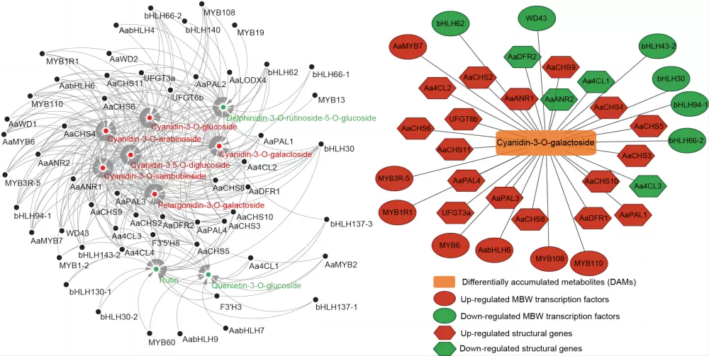
Correlation network graphs are created by calculating the correlation coefficients between variables to display the internal structure of data. They use elements such as the color, size, and thickness of nodes and connections to illustrate the interactions between significantly correlated feature nodes, in order to explore the relationships between variables. Variables can be a single data matrix or two data matrices, making it applicable for both single-omics analysis, such as metabolomics, proteomics, transcriptomics, microbiomics, etc., and for comparative analysis between two omics, such as metabolomics + proteomics, metabolomics + transcriptomics, etc.
2. Application Scope of Correlation Network Graphs
Correlation network graphs can be applied to metabolomics, proteomics, and genomics data. Network analysis is crucial for understanding complex biological systems by studying the differences in correlation structures across multiple conditions or timepoints. They are suitable for both single-omics analysis and comparative analysis between two omics. The correlation analysis methods used in correlation network graphs include Pearson, Spearman, Kendall, etc. For the correlation analysis of metagenomics and metabolomics, it is recommended to use the Spearman method.

3. How to Read a Correlation Network Graph
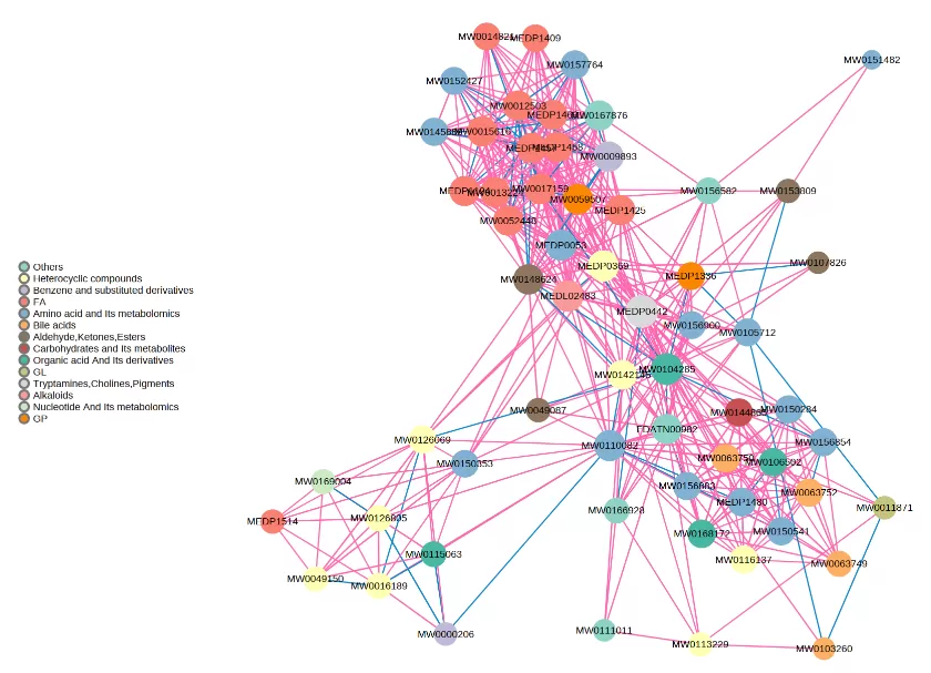
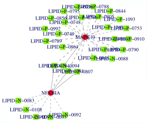
 Taking a single-omics metabolite correlation network graph as an example. Nodes in the graph represent significantly different metabolites, and the size of the nodes is related to their connectivity degree; the larger the node, the greater the connectivity, meaning the more neighboring nodes it is connected to. Pink lines represent positive correlations, and blue lines represent negative correlations. The thickness of the lines represents the magnitude of the absolute value of the correlation coefficient; the thicker the line, the stronger the correlation. For multi-omics, taking a metabolite-transcriptome correlation network graph as an example, metabolites are marked with green squares, and genes are marked with red circles. Solid lines represent positive correlations, and dashed lines represent negative correlations.
4. The Role of Correlation Analysis in Network Graphs
Since metabolomics data is less than that of transcriptomics and proteomics, single-omics correlations are often applied in metabolomics to measure the relationships between metabolites and identify key metabolite nodes. Additionally, multi-omics correlation network graphs can clarify the relationships between different omics, facilitating data mining to understand the regulatory processes from genes to proteins to metabolism. Clarifying the correlation strength between genes, proteins, and metabolites is crucial for further screening of biomarkers in research and their interrelated networks.

5. Explore Correlation Network Graphs with Metware Cloud Platform
Enhance your data analysis experience with Metware Cloud Platform, a robust platform that allows you to generate correlation network graphs quickly and for free. To see how it works, check out this video tutorial and start exploring today!
Read More:
- How to understand the WGCNA analysis in publications? (1/2)
- Understanding WGCNA Analysis in Publications
- Harnessing the Power of WGCNA Analysis in Multi-Omics Data
- WGCNA Explained: Everything You Need to Know
- Metabolomic Analyses: Comparison of PCA, PLS-DA and OPLS-DA
- Omics Data Processing Series
- Omics Data Analysis Series
Next-Generation Omics Solutions:
Proteomics & Metabolomics
Ready to get started? Submit your inquiry or contact us at support-global@metwarebio.com.


